Interactive Audio-Visual Artwork

Created 2015

This goal of this group project was to design and develop an interactive visual artwork with OpenFrameworks, demonstrating the skills we had learned using  XCode such as MIDI, keyboard entries, vectors, Haarfinder, Vidgrabber, ofMesh, VBO, classes.

Concept

Our project deals with the visualization of sound, specifically visualizing the human voice in an interactive and immersive way. The driving idea behind this piece is relative to how we use specific communication channels in order to perceive sound and visuals. Ordinarily, it is the auditory system that deduces sound characteristics where as visual perception calculates what we see. Our project intends to explore the crossover that can occur between these two. The bahaviour of the visual is completely dependent on the interaction of users. Results in output vary. It adds an interesting element to the mix when you consider how different people’s interactions may contrast and what the resulting visuals will look like. We wanted to emulate the visual process of hearing in our piece. Real life vibrations in the air come to fruition through our ‘exploding sphere’.

Design

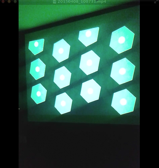
The design of our visualization aspires to be simple and concise in an effort to make how the user connects their vocal input to the mirrored abstract visual on screen seamless.  There are two key components that make up the output: the 3D sphere and a moving graph. These exist virtually within a 3D spherical grid space, introducing an element of depth. Focusing on the sphere first, it rotates on a fixed position and is made up of a vector of triangles that can be split. How it behaves is dependent on the ofSoundStream. As amplitude is monitored, it is scaled and mapped in real time. The scaled volume data determines the behaviour of the triangle vectors that make up the sphere. The louder the incoming sound, the greater distance the triangles disperse. Unless the system is in Mode 3, the sphere will always resume its original shape.Additionally, three light sources shine upon the circumference of the sphere enhancing the 3D presence using ofLight.

The graph on screen acts as a secondary source for audio representation. The graph collects the recent activity of sound within the buffer, iterating through the data volHistory, and deleting the oldest input data. It exists within the background of the piece. This is also achieved using a vector and further maintains the bond between sound and visuals. Information display moves from left to right.

There are also various states that the piece can assume. Ultimately, the behaviour of the shape shall represent user interaction but aesthetics and dynamics can be altered using the mouse and keyboard. There are three modes that the system can be in. Mode 1 uses a .png image as the texture of the sphere. Mode 2 uses the live webcam feedback as the texture while Mode 3 uses the former .png image. Mode 3 differs in dynamics because as the triangles disperse they do not reform to the original shape, introducing an interesting deconstruction of the shape that will remain until state change.

In addition to being able to shift between these modes using the left and right keys, a user can choose the amount of triangle splits by selecting a key with 1-4, four consisting of the largest amount of triangle splits. The user can also press the mouse to control the speed of rotation. The speed is relative to the position of the cursor on the X-axis while pressed. A series of Booleans also turn on and off states such as wireframes, points of splits and fill of the shape.

Demonstration

FYP Video Gallary

Demonstration Presentation:

Brief Code Overview:

Demo Day:

Prototype Logging:

FYP Image Gallery

Demo Day

Demo Day

Demo Day

Demo Day

Outdoor Station

Outdoor Station

Observer

Observer

Visualization

Visualization


Finished Station

Finished Station

Screen Shot 2015-04-15 at 02.26.54

User Interface


Screen Shot 2015-04-13 at 01.38.18

Final Product Visuals

Circuit

Circuit


Schematic

Schematic

Exposing Wind Sensor

Exposing Wind Sensor


PROCESSING

Flow Chart Visuals

MAXMSPFLOWNEW

Flow Chart Audio


Max Patch Development

p3 averaging

Weather Average to select scale


Scale Intensities 1-10

Scale Intensities 1-10


Processing: Twitter Balloons

Created 2014:

The objective of this project was to create an audio-­visualizer of data from a web-­stream. It works in fullscreen on a screen of any resolution. It is an an exported application that makes use of a settings.txt file  to setup the parameters of the system. Info-visualizations need to tell the story of the data in a minimal & attractive way. The system should:

1. Acquire & Parse the data stream
a. Computer Science

2. Filter & Mine for only the data that you need
a. Mathematics & Statistics

3. Represent as information reveals story/pattern behind the data
a. Graphic Design

The real time data that I used for this visualization is what could be acquired from Twitter. From using the Twitter API, peoples names, screen names, keywords, topics, followings, location etc. could be streamed. This data stream would then be filtered for only the information that I desire. The values obtained are used to scale outputs i.e. the length of the screen names, determined how big a balloon would look. The nature of the data stream Twitter provides reflects more on the personality of a user. It creates a digital clone of a user that exists in this ‘cloud’.

Initial Design

Initial Design

Twitter is used as a medium for users to share their thought at that particular instance with the world. People are then willing to let go of that information to higher power, which is this ‘cloud’. All this data is accumulated from all over the world with thoughts, opinions, topics etc. all co existing. The fundamentals of the graphic is design is to depict how all these opinions of the world exist and float out there separately but held together by the common denominator which is Twitter. I created what looks like balloons floating in the sky.

Development with PImage

Development with PImage

As the programme runs, the amount of tweets shall increase. As they accumulate, the user can observe and study how opinions may vary in certain topics. All these different opinions are tied together by this cloud of data. The center circle will slowly increase in size as the tweets build up and things become more chaotic. The user can also compare the ratio between people having followers to following people through the number/bar display. If they change (or add to) the, txt. file, they can compare the frequency of keywords being tweeted. Things appear calmer with less amount of tweets on the screen.

Demonstration:

Music – YogaBrickCinema: https://www.youtube.com/watch?v=BUaFugdLWyE

Video Explanation:

What I enhanced:

  • The use of classes
  • Better understanding of arraylists
  • How to import real time data and use it as I like.

Installation: Motus

Created 2014:

Motus is one of the two installations that makes up the exhibition ‘If this then that or that?’ Created by the fourth year students of Music Media and Performance Technology at the University of Limerick, Motus observes the development of simple agents that registers its real time environment activity and provides a representation of that data with specific sonic outcomes. The hallway of the Computer Science Building (CSIS) in UL, exhibits varying types of activity levels every day. It can often turn from hectic happenings one moment to a serene environment in another. But what of this energy that populates the CSIS? One of the aims of the Motus installation is to take this ambience that people create in the hallway and recreate it sonically. The installation attempts to accurately replicate atmosphere of its previous 3 hours 9 minutes. An IR sensor logs the activity level of the people passing. Therefore, humans, perhaps unknowingly, are the driving force behind the piece. Once this data is recorded, it is reinterpreted using a Arduino Uno microcontrollers which generate an output through solenoids. Through the power of sound, the piece attempts make reconnections back to human activities.

Installed

Installed

Testing Circuit

Testing Circuit

Floor  View

Floor View

The simple circuit was created in order to safely provide power to each solenoid . This circuit was to be replicated a further 5 times for each agent. The circuit is made up of two solenoids (one for the master), two LEDs, two 10k Ohms resistors, a 220 Ohms resistor, a 150 Ohms resistor, 47k Ohms resistor, a Darlington Driver and an N- Channel MOSFET.

The aim was to create an agent that could be both aesthetically pleasing and also sported a simplistic appearance. Considerations when making the design include build effectiveness, portability and cost efficiency. Sketches were drawn up before collecting materials to build. Corrugated plastic was used as the flat based to hold the circuit board/Arduino one-side and Solenoids, blocks and Glockenspiel keys on the other.

Explanation Video:

(credit to fellow student Stuart Duffy who created the above video)

My Role:

Roles were primarily split into four: Designers, Circuitry, Input Code and Rule implementation. I was heavily involved in the programming. This involved me writing code  for our specific Arduino Slave (the 50  unique rules reactive to activity conditions) and also contributing to the Master Arduino that will dictate how it stores crowd activity, how long and when it will play etc. This was done using Serial Communication. I also did a large amount of debugging. This involved creating dummy prototypes to test my groups Arduino Rules and also test all the slaves at once sending them false data from Pure Data. 

I have a paper written which thoroughly describes the programming, the design, circuitry and concept  of our project, Feel free to contact me.

AudioVisual Project: Binary Opposition

Created 2014:

The aim of this group project was to create a short (roughly 1-2 min) audio-visual composition, showing:
•    Original Content
•    Aesthetic Concept
•    Coherent Structure

Concept:

  • The perceptual unification (or making equivalent) of two dissociated representations of the same reality through a minimalistic audio‐visual composition. (Subverting the advertising efforts of a corporation.)
  • A video piece that displays the contrasting narratives put forth by corporations/vested interests and activists.
  • This piece displays two depictions of (parallel) realities. One of which consumers
    are more exposed to on a daily basis. It serves as a contrast between those two perceptions of reality; “inviting” aesthetics vs. “unpleasant” ones.
  • Channel A: a lavish high-end production; brand/product image; and corporate power. Displaying the power of seductive aesthetics. The corporate, glamourised advertising methods which mask the barbaric methods used to make certain products.
  • Channel B: amateur production hidden costs and victims. Revealing a ‘realistic perception’, which corporations would rather hide from public view.

Technical Approach:

  • Raw files were used which were taken from online sources. One Herbal Essence advertisement and footage of animal testing. These video sources were then tactically edited together within Max MSP for absolute accuracy.
  • Majority of the experimentation incorporated Max MSP.

My Role in this project:

  • Researched the subject matter.
  • Experimented with several Max MSP techniques/effects to explore different compositional strategies discussed.
  • Found relevant art pieces that were significant to our concept or shared similar subject matter.

Final Product:

Politics and Ethics:

Due to the inaccuracy of events suggested in the video, this is not intended for public attention, until the source material has been updated accordingly. It is only on this portfolio to showcase a previous project.

The online research did not find evidence to support a connection between the product featured in the advertisement (namely Clairol’s Herbal Essences) and cosmetics testing on Macaque monkeys or other non-human primates.

The proposed content of the piece would have clearly suggested to viewers that a direct link existed between the product being shown and the laboratory scenes in which a monkey was being experimented-on. Since hard evidence was not available to support the existence of such a link, the truthfulness of the piece was called into question.

To take liberties with the truth in a piece which itself purported to reveal a more essential form of it was deemed to be socially irresponsible by the artists. Furthermore, as a form of social and political activism, it was reckoned that it could have been ultimately self-defeating to drum-up support for a cause using potentially fictitious evidence. This would have, ironically, also aligned the artists more closely with the propaganda they sought to discredit.

A temptation, however, remained to use the available footage despite those potential consequences. This was due to the following reasons: Procter & Gamble (the parent company of Clairol, owner of the Herbal Essences brand) are still engaged in animal testing of their cosmetic products in China (News, 2013). In 2008, it was revealed that Herbal Essences product ingredients were inhumanely tested on rats (News, 2013). In 2011, P&G falsely claimed that Herbal Essences was not tested on animals and were forced to retract the claim by the Advertising Standards Authority in the UK (Uncaged, 2011). Finally, in 1990 P&G reportedly lobbied against legislation to prevent a ban on the Draize test in California (Wesleyan, 2014). So while P&G/Herbal Essences cannot be directly linked to animal testing activity involving primates, it can be inferred that their activity supports the institutions and culture in which such testing is condoned and practiced.

Nevertheless, it was deemed that using the macaque testing footage was ineffective and the piece would not be released publically until an accurate substitute was found, e.g. footage of Draize tests or cosmetic tests on rats.

Processing: Drawplay

Created 2014:

The aim of this project was to design, code, test, evaluate and document an application written in Processing: drawplay.

The application should has a window (a canvas) where the user can draw lines with the pointing device (mouse, trackpad).

  • Each line represents a simple synthesised sound, where the length of the line is the duration and the vertical is the pitch (the fundamental frequency).
  • A line in the left half of the window will play before a line in the right part of the window, based on a play-cursor (a vertical line) moving across the window from left to right.
  • When the play-cursor reaches the right hand side of the window, it will reappear at the left hand boundary and continue to play.
  • Play/stop is controlled by pressing the space-bar. It is possible to change between 5 different colours of the lines drawn by the user, by pressing the keys 1-5.
  • Each colour represents a specific timbre, red:sinewave, blue:square wave, etc.
  • The playback speed, i.e. how fast the play-cursor moves across the screen, can be changed by pressing up-arrow/down-arrow keys.
  • The source code of the finished application was uploaded to my individual web site on richmond.csis.ul.ie, placed in a simple web page together with a screenshot of the application.

HTML page:

HTML where project was uploaded

HTML where project was uploaded

Final Application:

Max MSP Algorithmic Processes

Created 2014:

For own final assessment in Digital Media Software and Systems 4 in 2013, we were required to build a music performance system in Max MSP that illustrates the algorithmic processes covered in this course. We had to perform with this system in a live context, in groups of five people. Each one of use would focus on different algorithmic processes within our patch. The video below is just a demonstration of my part. Others focused on drums samples, vocoders, synth etc. and we would then play together simultaneously. The algorithmic processes which we studied for this involved:

• random, drunk, and urn
• weighted distribution
• Markov chain
• fractal or self-similar process
• Logistics Map
• other chaotic process (Hénon, etc.)

The patch demonstrated below features Markov Chain and random, drunk, and urn. Our aim as a group was to manipulate the stochastic behaviour of the algorithms in such a way that is was still pleasing i.e. or notes were random but only within specific scales in order to sound pleasing.

Demonstration:

(I will be rerecording a demo of this with internal recording to omit the noise interference,)

Mobile Application Basics: BlueJ

In my third year of college I chose Mobile Application as my elective. This module appealed to me because I have a passion for creating code whereby the end product can produce fascinating results. I wanted to enhance my programming skills with regards with mobile application in order to strengthen my skill set and better my chances in the future of obtaining employment. Weekly labs were very beneficial and provided me with the foundational knowledge required before tackling advanced projects in Mobile Application. The module primarily focused on using BlueJ but it is an intention of mine to further educate myself in the near future with regards to creating mobile apps and using Java software.

World Clock Development

World Clock Development

Lab Work

Lab Work

Our final project was to develop an application that will allow users view several times (or clocks) on their screen simultaneously. This type of application is often packaged in Smart-phones and other devices. The application was to provide the user with a list of cities/locations to choose from. The user should be able to select one (or more) cities and then click on the “plus” button (or its equivalent) to add them to the display. Selecting a city or cities and clicking on the “minus” button (or its equivalent) should remove those cities from the display. This projects, and smaller ones before this, displayed the use of layout managers, containers, colours, fonts, borders, spacing and so on.

Below is a video showcasing the final project and some other the other lab works: