Real Time Data Ambient Display

Title

Creating an ambient display in order to explore the tensions that exist between the aesthetic and functionality within ambient informative art.

Project Summary

The intent of this project was to investigate the intersection between the aesthetic choices digital artists make when designing an ambient display and the information those aesthetics can deliver. It examined the line between aesthetics and utility in informative ambient displays; the process in which artists create informative art, and how those who observe these artistic mediums can perceive the working forces behind the abstract forms presented.

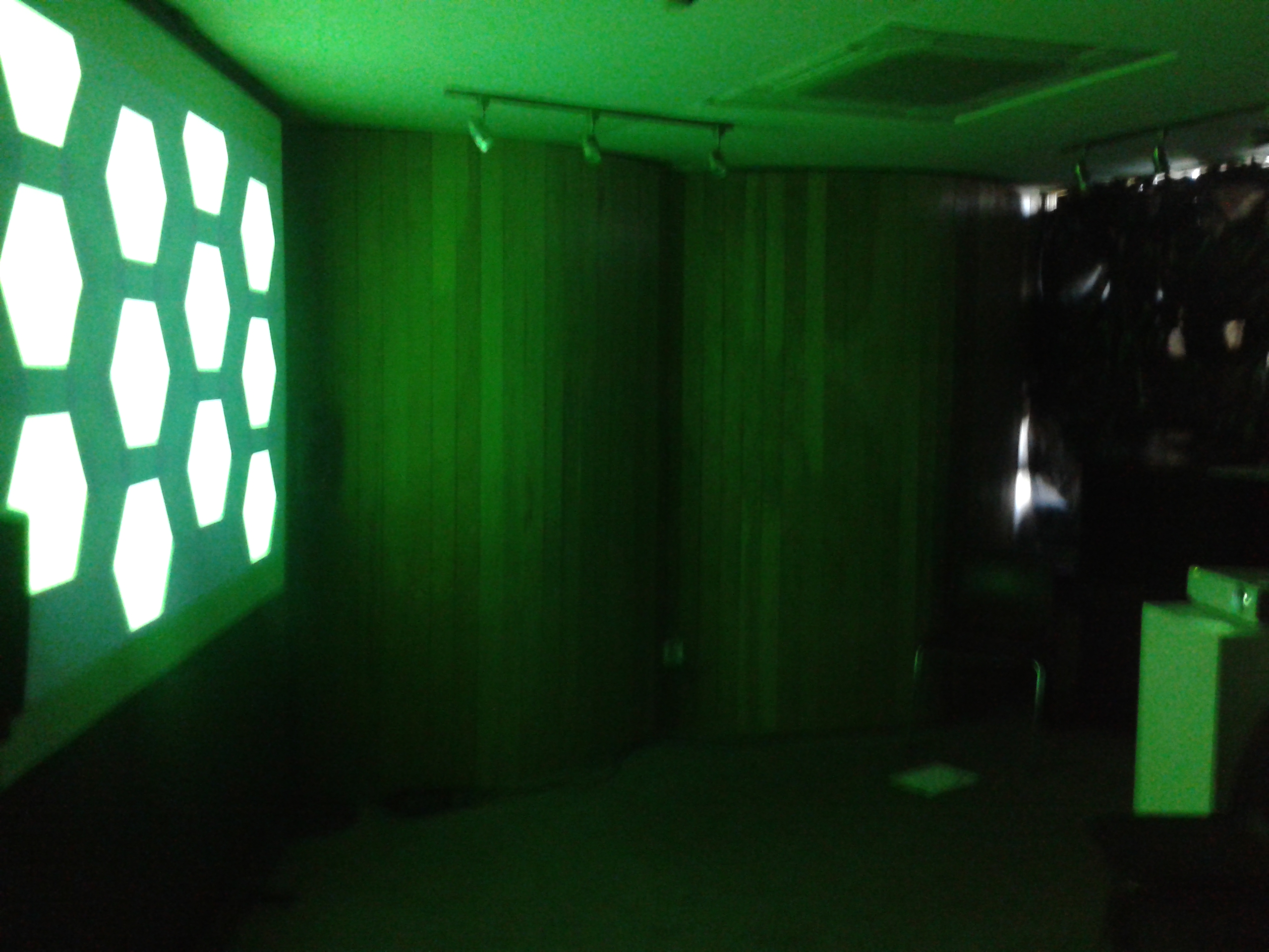
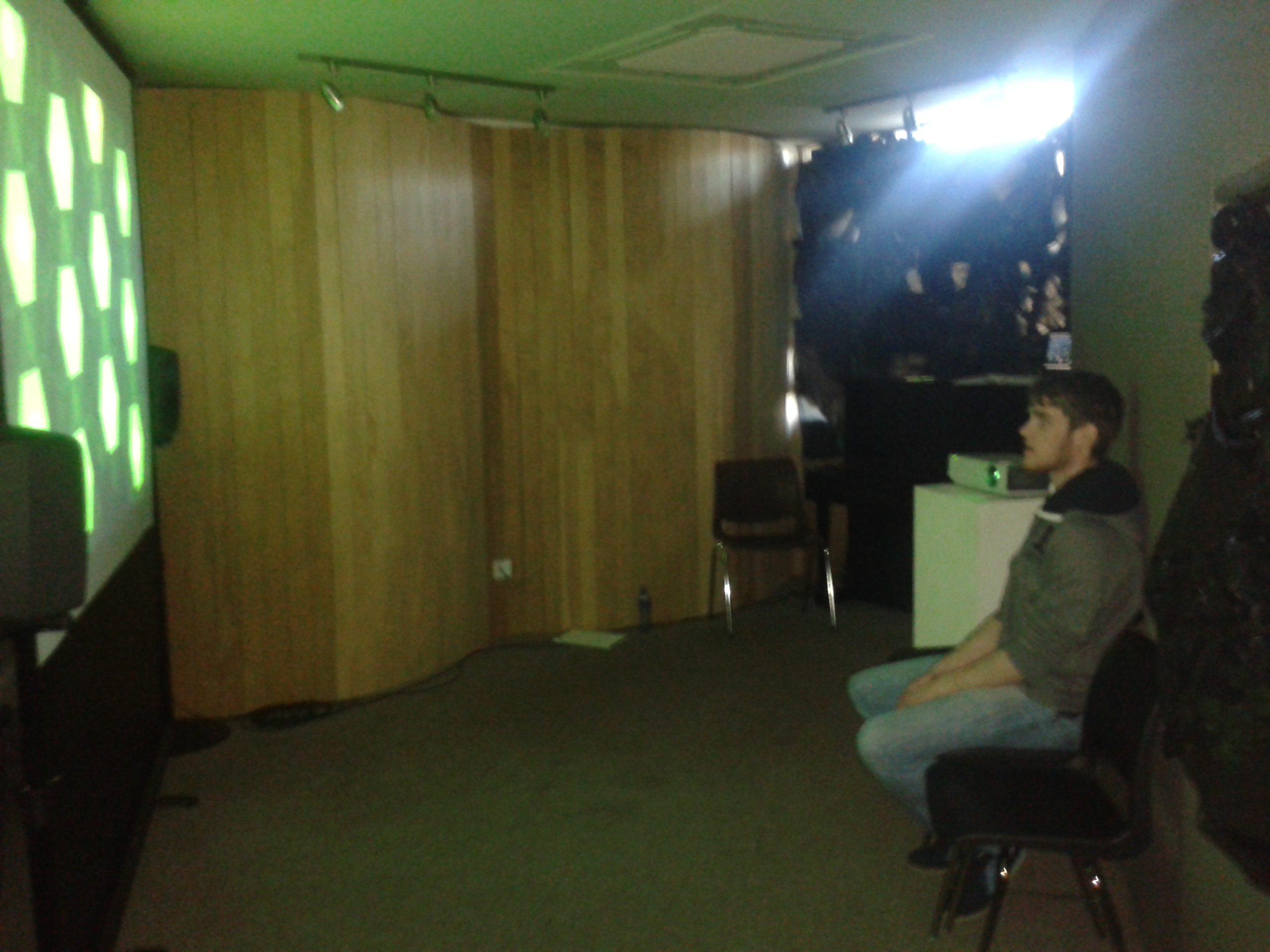
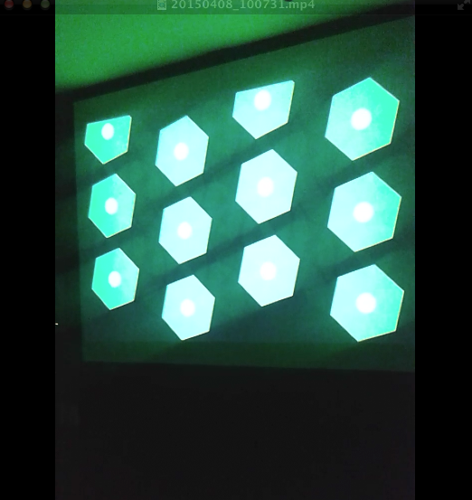
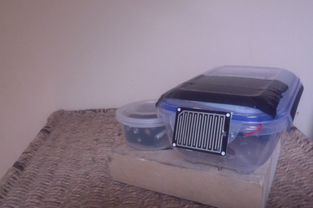
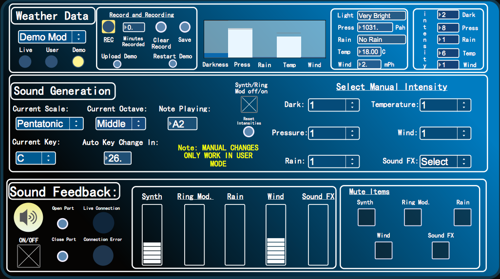
To assist the extensive research regarding aesthetics and utility, an ambient weather display was created that could transmit information in the background or the periphery of a person’s attention, whereby a person could check the state of a display by glancing at it and not be overwhelmed with information processing. This ambient display used both audio and visual communication channels to inform observers of the current weather conditions based on where the weather station was located. A mini weather station was designed and placed outside the Computer Science building in UL whereby its meteorological sensors acted as inputs to generate a dynamic soundscape and visualization in real time indoors. Through data analysis, normalising data and mapping techniques, the output of data was more than arbitrary. The colours, speed of movement, positioning of shapes, key, scale etc. created changed to reflect updates in the data thus becoming a narrative. The metaphorical data output prompted a link with the human minds understanding of the world relating to weather via the aesthetic contextual undertones that may worry, annoy, relax, and excite a person.

Software used
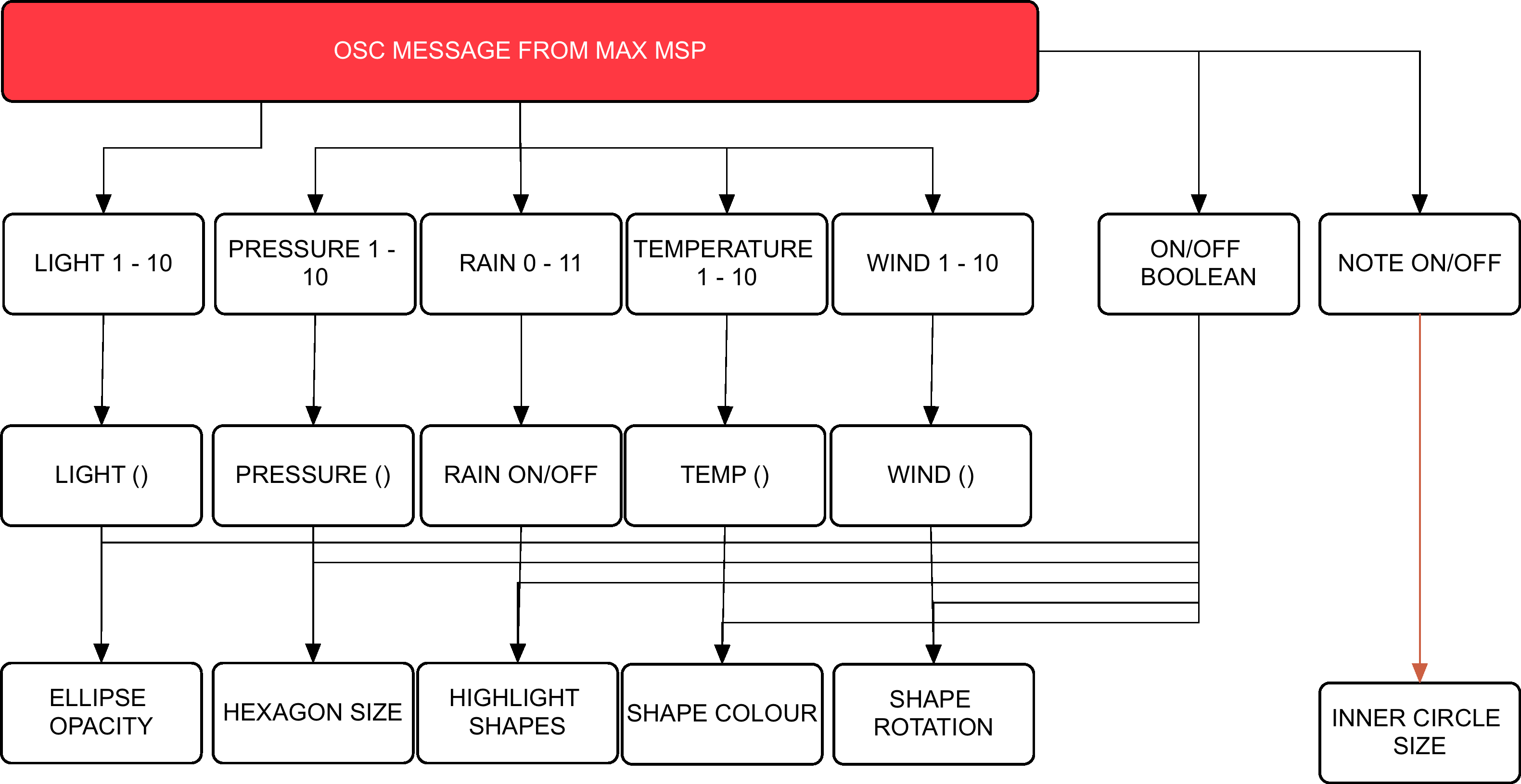
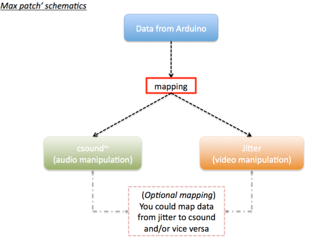
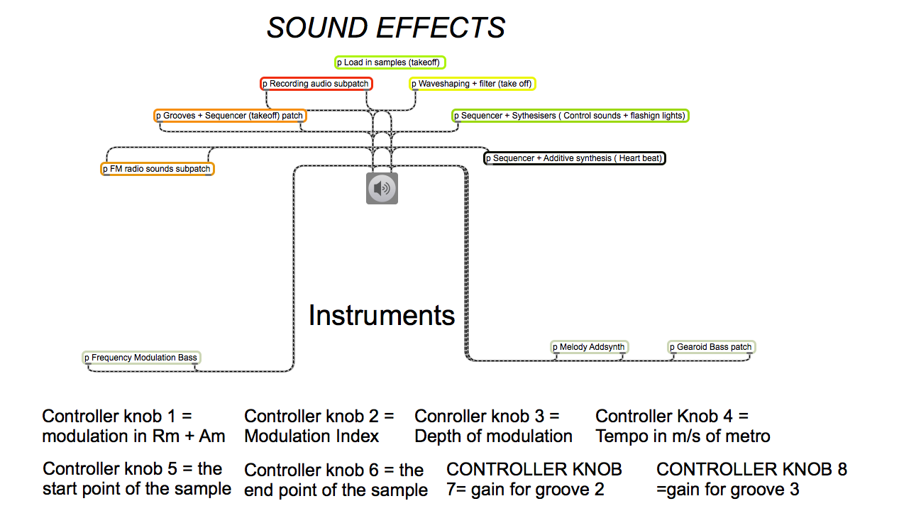
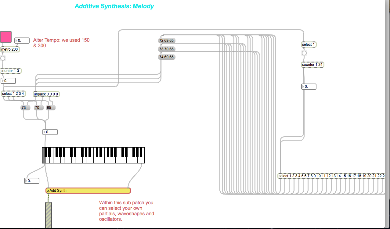
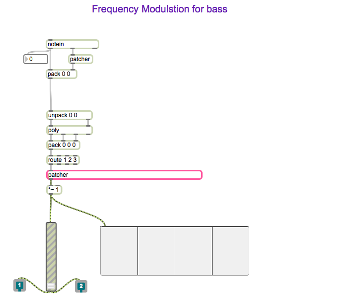
Arduino controls the meteorological sensors that monitor weather behaviour. This data is then sent to Max MSP via the Bluetooth module. Max MSP is responsible for calculating the weathers ‘pleasantness’, generating the audio attributes of the project and then passing the intensity levels onto Processing in a form of OSC messages. Processing then generates the visuals on screen whereby the dynamics will synch with the audio output.

Hardware

Arduino Uno, Barometric/Temperature Sensor, Rain Sensor, Wind Sensor, Photocell, Bluetooth Module, 6 AA NiMh batteries.

Microcontroller & Power Supply:

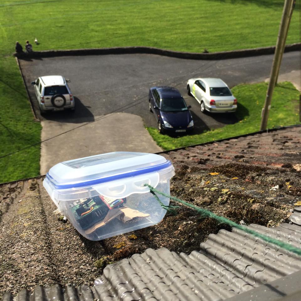
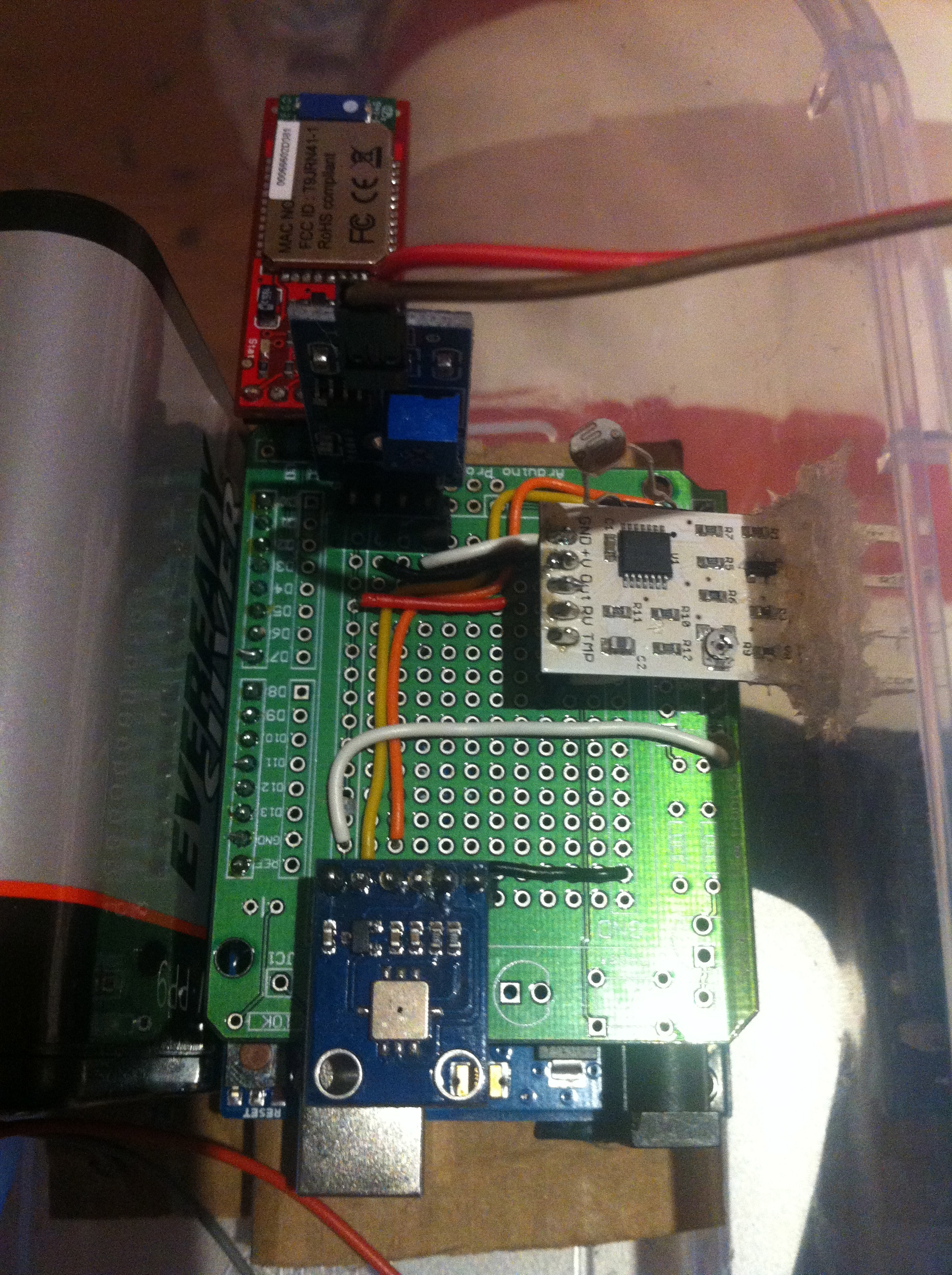
The type of microcontroller that was chosen for this project was the Arduino Uno R3. This is a microcontroller on a circuit board, which makes it easy to receive inputs and drive outputs. The Arduino Uno can be used to develop stand-alone interactive objects or can be connected to deliver data to software on your computer (e.g. Processing, Max MSP). Programming can be uploaded to the board to dictate its performance. The board provides the project with what is needed to incorporate several sensors, send data and also allow external power source. Through testing various power supplies (9v pp3, 9v pp9 and a pack 4 Alkaline 1.2v batteries all failing requirements) the best alternative to bring power to the circuit was a pack of 6 NiMH rechargeable batteries that had a capacitance of 2000 mAh each.
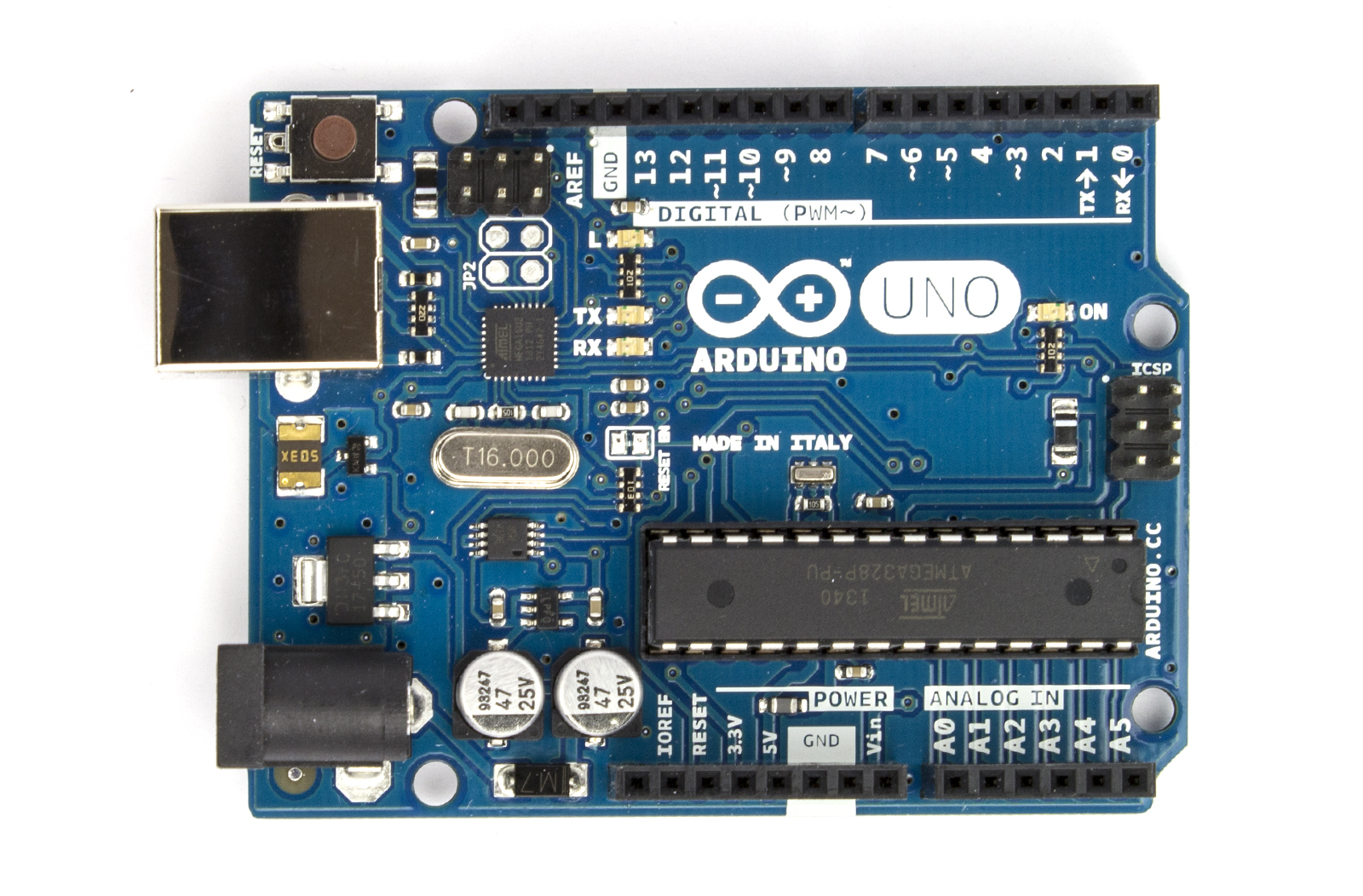
Arduino Uno

Arduino Uno

Photocell

The goal with being able to monitor the amount of light was an attempt to deduce the amount of cloud coverage. If there was more overcast as a result of blocked sunshine, then light levels would reduce. Light levels of a specific area could be assessed using a basic miniature Photocell. Photocells are capable of reacting to ambient light. Experimentations were considered with various resistors to accompany the photocell on the circuit but ultimately the Arduino’s internal resistor, 20k resistor, was called into use via the sketch. Any subtle changes in light values were to be monitored using specific ‘if statement’ objects within Max MSP.

BMP085

Air pressure and temperature are two key features when determining weather state. Low barometric pressure and temperature signifies ‘unpleasant’ weather whereby high-pressure readings and high temperatures normally result in ‘pleasurable’ weather. Fortunately there is a sensor that can monitor both, the BMP085. Precaution has to be taken when mounting this sensor. Its data sheet indicates that it must be well ventilated, advice that needs to be deliberated considering the weather station will be situated outside and exposed to hot air being trapped within the enclosure, resulting in inaccurate readings. The sensor itself is also sensitive to light. It can influence the accuracy of the measurement of the photocurrent silicon.

BMP085

BMP085

Wind Sensor

Cautious installation had to be implemented for the final two meteorological sensors; wind and rain. This is because these two need to be exposed to the outside of the enclosure, with non-waterproof parts remaining protected from the elements. The way that the wind sensor is constructed allows the tips of the sensor to be exposed through a slot or detached from the main body and extended. The sensor uses a traditional sense of measuring wind speeds. It uses what is called a “hot-wire” technique. A constant temperature of an element is maintained. The wind changes will then vary the temperature of that element and it is the measurement of the amount of electrical power needed to maintain the constant.

wind sensor

wind sensor

Rain Sensor

The rain sensor is equipped with a board to be exposed to the rain and a control board, which will be integrated into the circuit within the enclosure. The basic explanation of how this sensor works is that it is an alternative variable resistor. The rain board that sits outside the enclosure will determine how much current will follow through it based on the wetness of it. The wetter the board, the more current is conducted. The project circuitry uses an analogue pin to receive signal in oppose to using the digital ones. This way can determine just how wet the board is ranging 0 – 1023.

rain sensor

rain sensor

Wireless Communication

For a project of this magnitude, using Bluetooth as a means of communicating data seemed appropriate. This means that distance between station and a paired computer point is limited to 10 meters at best but, given the correct location, would function perfectly. The BlueSMiRF Gold was selected as the most suitable for sending the weather stations data. It is capable of doing so by establishing a connection with the paired computer’s Bluetooth serial port and performing serial communication.

Bluetooth Module

Bluetooth Module

Photo Gallery

This slideshow requires JavaScript.

Videos

Interactive Audio-Visual Artwork

Created 2015

This goal of this group project was to design and develop an interactive visual artwork with OpenFrameworks, demonstrating the skills we had learned using  XCode such as MIDI, keyboard entries, vectors, Haarfinder, Vidgrabber, ofMesh, VBO, classes.

Concept

Our project deals with the visualization of sound, specifically visualizing the human voice in an interactive and immersive way. The driving idea behind this piece is relative to how we use specific communication channels in order to perceive sound and visuals. Ordinarily, it is the auditory system that deduces sound characteristics where as visual perception calculates what we see. Our project intends to explore the crossover that can occur between these two. The bahaviour of the visual is completely dependent on the interaction of users. Results in output vary. It adds an interesting element to the mix when you consider how different people’s interactions may contrast and what the resulting visuals will look like. We wanted to emulate the visual process of hearing in our piece. Real life vibrations in the air come to fruition through our ‘exploding sphere’.

Design

The design of our visualization aspires to be simple and concise in an effort to make how the user connects their vocal input to the mirrored abstract visual on screen seamless.  There are two key components that make up the output: the 3D sphere and a moving graph. These exist virtually within a 3D spherical grid space, introducing an element of depth. Focusing on the sphere first, it rotates on a fixed position and is made up of a vector of triangles that can be split. How it behaves is dependent on the ofSoundStream. As amplitude is monitored, it is scaled and mapped in real time. The scaled volume data determines the behaviour of the triangle vectors that make up the sphere. The louder the incoming sound, the greater distance the triangles disperse. Unless the system is in Mode 3, the sphere will always resume its original shape.Additionally, three light sources shine upon the circumference of the sphere enhancing the 3D presence using ofLight.

The graph on screen acts as a secondary source for audio representation. The graph collects the recent activity of sound within the buffer, iterating through the data volHistory, and deleting the oldest input data. It exists within the background of the piece. This is also achieved using a vector and further maintains the bond between sound and visuals. Information display moves from left to right.

There are also various states that the piece can assume. Ultimately, the behaviour of the shape shall represent user interaction but aesthetics and dynamics can be altered using the mouse and keyboard. There are three modes that the system can be in. Mode 1 uses a .png image as the texture of the sphere. Mode 2 uses the live webcam feedback as the texture while Mode 3 uses the former .png image. Mode 3 differs in dynamics because as the triangles disperse they do not reform to the original shape, introducing an interesting deconstruction of the shape that will remain until state change.

In addition to being able to shift between these modes using the left and right keys, a user can choose the amount of triangle splits by selecting a key with 1-4, four consisting of the largest amount of triangle splits. The user can also press the mouse to control the speed of rotation. The speed is relative to the position of the cursor on the X-axis while pressed. A series of Booleans also turn on and off states such as wireframes, points of splits and fill of the shape.

Demonstration

FYP Image Gallery

Demo Day

Demo Day

Demo Day

Demo Day

Outdoor Station

Outdoor Station

Observer

Observer

Visualization

Visualization


Finished Station

Finished Station

Screen Shot 2015-04-15 at 02.26.54

User Interface


Screen Shot 2015-04-13 at 01.38.18

Final Product Visuals

Circuit

Circuit


Schematic

Schematic

Exposing Wind Sensor

Exposing Wind Sensor


PROCESSING

Flow Chart Visuals

MAXMSPFLOWNEW

Flow Chart Audio


Max Patch Development

p3 averaging

Weather Average to select scale


Scale Intensities 1-10

Scale Intensities 1-10


Processing: Twitter Balloons

Created 2014:

The objective of this project was to create an audio-­visualizer of data from a web-­stream. It works in fullscreen on a screen of any resolution. It is an an exported application that makes use of a settings.txt file  to setup the parameters of the system. Info-visualizations need to tell the story of the data in a minimal & attractive way. The system should:

1. Acquire & Parse the data stream
a. Computer Science

2. Filter & Mine for only the data that you need
a. Mathematics & Statistics

3. Represent as information reveals story/pattern behind the data
a. Graphic Design

The real time data that I used for this visualization is what could be acquired from Twitter. From using the Twitter API, peoples names, screen names, keywords, topics, followings, location etc. could be streamed. This data stream would then be filtered for only the information that I desire. The values obtained are used to scale outputs i.e. the length of the screen names, determined how big a balloon would look. The nature of the data stream Twitter provides reflects more on the personality of a user. It creates a digital clone of a user that exists in this ‘cloud’.

Initial Design

Initial Design

Twitter is used as a medium for users to share their thought at that particular instance with the world. People are then willing to let go of that information to higher power, which is this ‘cloud’. All this data is accumulated from all over the world with thoughts, opinions, topics etc. all co existing. The fundamentals of the graphic is design is to depict how all these opinions of the world exist and float out there separately but held together by the common denominator which is Twitter. I created what looks like balloons floating in the sky.

Development with PImage

Development with PImage

As the programme runs, the amount of tweets shall increase. As they accumulate, the user can observe and study how opinions may vary in certain topics. All these different opinions are tied together by this cloud of data. The center circle will slowly increase in size as the tweets build up and things become more chaotic. The user can also compare the ratio between people having followers to following people through the number/bar display. If they change (or add to) the, txt. file, they can compare the frequency of keywords being tweeted. Things appear calmer with less amount of tweets on the screen.

Demonstration:

Music – YogaBrickCinema: https://www.youtube.com/watch?v=BUaFugdLWyE

Video Explanation:

What I enhanced:

  • The use of classes
  • Better understanding of arraylists
  • How to import real time data and use it as I like.

AudioVisual Project: Binary Opposition

Created 2014:

The aim of this group project was to create a short (roughly 1-2 min) audio-visual composition, showing:
•    Original Content
•    Aesthetic Concept
•    Coherent Structure

Concept:

  • The perceptual unification (or making equivalent) of two dissociated representations of the same reality through a minimalistic audio‐visual composition. (Subverting the advertising efforts of a corporation.)
  • A video piece that displays the contrasting narratives put forth by corporations/vested interests and activists.
  • This piece displays two depictions of (parallel) realities. One of which consumers
    are more exposed to on a daily basis. It serves as a contrast between those two perceptions of reality; “inviting” aesthetics vs. “unpleasant” ones.
  • Channel A: a lavish high-end production; brand/product image; and corporate power. Displaying the power of seductive aesthetics. The corporate, glamourised advertising methods which mask the barbaric methods used to make certain products.
  • Channel B: amateur production hidden costs and victims. Revealing a ‘realistic perception’, which corporations would rather hide from public view.

Technical Approach:

  • Raw files were used which were taken from online sources. One Herbal Essence advertisement and footage of animal testing. These video sources were then tactically edited together within Max MSP for absolute accuracy.
  • Majority of the experimentation incorporated Max MSP.

My Role in this project:

  • Researched the subject matter.
  • Experimented with several Max MSP techniques/effects to explore different compositional strategies discussed.
  • Found relevant art pieces that were significant to our concept or shared similar subject matter.

Final Product:

Politics and Ethics:

Due to the inaccuracy of events suggested in the video, this is not intended for public attention, until the source material has been updated accordingly. It is only on this portfolio to showcase a previous project.

The online research did not find evidence to support a connection between the product featured in the advertisement (namely Clairol’s Herbal Essences) and cosmetics testing on Macaque monkeys or other non-human primates.

The proposed content of the piece would have clearly suggested to viewers that a direct link existed between the product being shown and the laboratory scenes in which a monkey was being experimented-on. Since hard evidence was not available to support the existence of such a link, the truthfulness of the piece was called into question.

To take liberties with the truth in a piece which itself purported to reveal a more essential form of it was deemed to be socially irresponsible by the artists. Furthermore, as a form of social and political activism, it was reckoned that it could have been ultimately self-defeating to drum-up support for a cause using potentially fictitious evidence. This would have, ironically, also aligned the artists more closely with the propaganda they sought to discredit.

A temptation, however, remained to use the available footage despite those potential consequences. This was due to the following reasons: Procter & Gamble (the parent company of Clairol, owner of the Herbal Essences brand) are still engaged in animal testing of their cosmetic products in China (News, 2013). In 2008, it was revealed that Herbal Essences product ingredients were inhumanely tested on rats (News, 2013). In 2011, P&G falsely claimed that Herbal Essences was not tested on animals and were forced to retract the claim by the Advertising Standards Authority in the UK (Uncaged, 2011). Finally, in 1990 P&G reportedly lobbied against legislation to prevent a ban on the Draize test in California (Wesleyan, 2014). So while P&G/Herbal Essences cannot be directly linked to animal testing activity involving primates, it can be inferred that their activity supports the institutions and culture in which such testing is condoned and practiced.

Nevertheless, it was deemed that using the macaque testing footage was ineffective and the piece would not be released publically until an accurate substitute was found, e.g. footage of Draize tests or cosmetic tests on rats.

Digital Performance System

Created 2013:

The project sees Arduino/Electronics, CSound & Jitter come together  creating an audiovisual system to perform with. It enables live video manipulation and live control of CSound synthesis. We created a simple hand held box that contained two buttons, an accelerometer and an Arduino microcontroller. This gave us control over what was heard and seen i.e. the buttons could toggle through different states while tilting the boxed changed specific values in each selected state. We used referenced video loops to manipulate the visuals in Max MSP, we, however, created all the audio components ourselves within CSound through coding. This included the bass, kick and snare you can hear in the demo. How these sounds are triggered is determined within Max MSP based on the gating system I created to filter signals from the Arduino. The videos below give further explanation and you can click here to read our NIME style paper.

Our end product had the ability to:

  • Send sensor data from Arduino into Max MSP.
  • Enable the manipulation and control of audio and video using sensors through mapping techniques.
  • Run CSound in real-time via the Max MSP csound~ object. Audio material for CSOUND:
  • Manipulate video loops within our Jitter patch.
Schematic Route

Schematic Route

Explanation and Demonstration:


Screenshots:

Max Patch 1

Max Patch 1

Max Patch 2

Max Patch 2


Max Patch 4

Max Patch 4

Max Patch 3

Max Patch 3


CSound Segment

CSound Segment

Short Animation : Terms of Rhythm

Created 2012:

Short clip which combined the use of Max MSP instruments we created to correspond the actions of animation created using Adobe Illustrator.  This was a group project whereby my main responsibility was to create the composition that plays throughout the animation. The composition was created within Max MSP. Further edits were later made to the piece within Logic Pro, just to add an effect or two such as fade ins, volume control, reverb etc. We all shared the workload evenly with others focusing on the animation and sound effects.

Concept:

Terms of Rhythm’ explores the emotional aspects of the human psychological and psychophysical responses to events at different time scales. The word rhythm is taken in both its traditional musical sense of ‘regular recurrence, esp. of stresses’ (Chambers 20th Century Dictionary) and also in the broader sense of patterns occurring on scales which lie outside the span of perceptible rhythm where—ordinarily—’the perception of the rhythm, objective or subjective, disappears if the intervals are either too short or too long’ (Fraisse, 1982). It is a study of the human experience of time exemplified in the special case of an astronaut manning a launching space shuttle. The event of the launch is played at 3 different time scales: normal, 1/20th speed, and x50 speed respectively. It is observed that the experience of tension is diminished on those scales far removed from normal human perception raising the question of whether or not the metaphysical essence of the event (as a whole) is maintained invariantly across different time scales. A musical composition characterised by having both slow, serene sections alternated with contrasting fast, frenetic sections is layered over the 3 time sections such that each rate of time is experienced with both slow and fast dynamics. This challenges the viewer’s assumptions of what the astronaut is experiencing emotionally.

Screenshots:

Storyboard

Storyboard

Edits in Logic

Edits in Logic

Max MSP Instrument sub patches

Max MSP Instrument sub patches

Max MSP patch segment

Max MSP patch segment

Max MSP patch segment

Max MSP patch segment

Hans Richter Project: Adding audio to visual piece


Created 2011:


As part of my module Digital Media Software & Systems 1, I was required to create my own audio piece to play over the abstract film ‘Rhythmus 21’ by Hans Richter.  This  was one of my first projects using Logic Pro. My aim was to play my own midi files I had created over the silent video and also incorporate audio files. I was excited to be given such a project as it would challenge my skills using Logic Pro and my ability to combine sound and film.

How I approached it:

To begin with, I first watched the entire ‘Rhythmus 21’ video  to see if any ideas jumped out at me. Seeing as it was an old fashioned video, I decided that a contemporary composition would not suit it and that classical instruments would be best suited.  I searched through various sound files in order to find ones that suited the video. My aim with the sound files was to insert audio files that worked with the video. For example when shapes seemed to be approaching the viewer, I inserted audio which was ascending and increasing in volume. The shapes actions would each have a corresponding noise effect. With the assistance of the markers, I was capable of selecting exactly where I wanted to put my audio files. I made several audio files from my three selected sound files I chose.  I then edited the audio files to add more realistic effect, i.e. fade ins, fade outs, reversing etc., to the shapes actions.

Screen Shot of my editing

Correct use of automation gave the shapes life. Within the mixer, I grouped the three audio tracks and added a suitable reverb effect. Once I was satisfied with the audio effects, I composed my instrument MIDI files around them. I did not want to take from the audio effects so I kept it simple by adding only three instruments. I tested it out with more instruments but it just felt too congested. A classical sound of strings and piano seemed suitable for this project. I added a basic drum beat and sent it through Bus 1 to suit the mood of the video. My objective was to create a composition where by the audio files acted as sound effects of the moving shapes and the MIDI instruments could set the tone of the video.

From this project:

  • I significantly strengthened my skills regarding Logic Pro and how to create a composition.
  • I learned how to incorporate my own audio samples into a video segment
  • How to place the audio files in the exact best position of the video.