
For the mobile campus car park tracking application, we used two types of evaluation techniques to investigate the potential design problems and usability problems that potential users may have. Since the application can be used in two settings, we designed two evaluations to highlight the different views that users may have in these scenarios.
For the first setting, we were interested in seeing how the user will use the application when outside of their vehicle e.g. checking the car parks from their home before leaving to get to campus. This evaluation used the think-aloud technique where the user is asked to dictate their thought process at each stage of the task list provided. This technique allows us, as designers, to see how the users will use the application and any problems that may arise in their conceptual model.
For the second setting, we were interested in seeing how the user will use the application when they are inside their vehicle. This is due to the possible safety risks that are associated with mobile phone usage while driving. Although as designers, we encourage that the users do not use the application while driving, we have to make the application require the least attention if they chose to use the driving mode. For this setting, we chose to do a body-storming session. Bodystorming is similar to brainstorming but it is exploring a product in the setting it will be used in. This allowed us to get a scenario-based insight into the users’ conceptual model as they use our application.
Evaluation 1: Thinking Aloud
The plan for this evaluation was to give the user a set of tasks and have them complete them sequentially while saying their thought process out loud. We chose our design center to carry out the evaluations as there were large desks and it was a comfortable space for users to be in.
The first step was to recruit the users. For this we placed a post on social media saying what we were planning on doing, the location and the time that it was on. This medium was chosen due to the main user group being students that drive to campus and possess a mobile smart phone. A written declaration of consent was printed for the users so that we could document the information of their evaluations with their permission.
Before the evaluation occurred, the design team needed to draft a task list for the users to complete. It was important to select the right type of tasks as they must be do-able by the users, they must be representative of real tasks the users do and they must explore the prototype thoroughly. We had certain criteria the task list had to meet. These included:
- Can the tasks be completed with the current prototype?
- Are the tasks focused on the main features of the application?
- Are the tasks written in a clear and concise manner for novice users?
- Are the tasks specific?
We estimated that the complete task list would take about three minutes to complete so we allowed for the evaluation to take five minutes in total.
Our task lists comprised of the following tasks:
- Sign up to application.
- Log in to application.
- Show legend of map & close
- Select car park of choice.
- Switch to data view of current car park.
- Return to full map of campus.
- Set Favourite Zone Type in Settings.
- Set Notifications on in Settings.
- Sign out of application.
Before the users arrived, we did our check of equipment needed in the evaluation. We checked that the paper prototype was ready, all the screens present and numbered in chronological order. The task list was checked and placed where the user would sit. We tested our recording equipment that would video and record the session and the notebook and pens that would document the users’ thoughts and feedback.
We had five users in total take part in the evaluation of the mobile application with varying feedback and problems.
Throughout the whole interaction we encouraged users to talk through their ideas and ask us questions. If users strayed from commenting on their actions or thought processes we would ask guiding questions to bring them back on track and make them feel more comfortable. Accompanying the user-facing task sheet we had also prepared some questions to ask during the process as a whole and upon landing at specific task milestones. Each team member had a copy and was familiar with these questions so as to keep the conversation flowing during testing. We noted when users deviated from the task or ran into moments of confusion. These notes comprised of time estimates of when the notable moment occurred in the testing and a short note about its relevance to the project. As we had multiple team members present it was possible for us to record what we found notable in different mediums. We could enquire further through conversation, record audio and video dynamically with reference to specific screens and also make relevant notes to the moments of interest.
Separate to the moments that we found notable we made sure to enquire about what the users found most interesting. This often included positive and negative points from each user. This proved to be of great value as offered comments critical user perceptions of what was important to fix, improve on, implement or affirm our existing ideas.


After each evaluation we conducted a debriefing session, where we reflected upon any problems they had and features they liked. This allowed us to get more concise recommendations that we could pursue for our redesigns. We welcomed a friendly discussion whereby we could learn from the users experience. The following recommendations were noted:
- The uses of symbols are confusing for people unfamiliar to them.
- Use of colour is important in the legend and should be consistent throughout the application.
- The alternative style menu is more user friendly to certain users.
- Some of the terms used can seem ambiguous (free & empty or free & not paid).
Evaluation 2: Bodystorming
The plan for this evaluation was to give the user a set of tasks and have them complete them sequentially while being in the situation that the application would be used in. We chose the students’ cars to carry out the evaluations, as it was a familiar and comfortable space for users to be in. The steps taken for the evaluation preparation were similar to the previous.
The first step was to recruit the users. We contacted students that we knew that had cars and use the car parks around the campus. A written declaration of consent was printed for the users so that we could document the information of their evaluations with their permission.
Before the evaluation occurred, the design team needed to draft a task list for the users to complete. It was important to select the right type of tasks relevant to the context of the situation and they must explore the prototype thoroughly in that context. We had certain criteria the task list had to meet. These included:
- Can the tasks be completed with the current prototype in the scenario?
- Are the tasks focused on the main features of the application?
- Are the tasks written in a clear and concise manner for novice users?
- Are the tasks specific?
For the purpose of this evaluation, we felt it would be best to have the user attempt the task list twice; completing it once while the car was stationary before driving and then trying to complete the task list while driving i.e. stuck in traffic. Ideally the application is aimed to be used stationary but we anticipate drivers to interact with it while in transit. We estimated that the complete task list would take about three minutes to complete so we allowed for the evaluation to take five minutes in total. We modified the previous task list in order to replicate how the user may interact with the application while in the car.
Our task lists comprised of the following tasks:
1. Can the user enter drive mode?
2. Can the user select their car park they wish to use?
3. Can the user retrieve the information for the selected car park?
4. Can the user exit drive mode?
Before the users arrived, we did our check of equipment needed in the evaluation. We checked that the paper prototype was ready, all the screens present and numbered in chronological order. The task list was checked and placed where the user would sit. We tested our equipment that would record the session and the notebook and pens that would document the users’ thoughts and feedback.
We had three users in total take part in the evaluation of the mobile application with varying feedback and problems. Firstly, we explained to our users that selecting drive mode would result in a data sonification for the purpose of this experiment. This would involve an audio version of the most fundamental details of a selected space i.e. updating the users of vacancies available of preferred space type and location. We explained that we would read the task list out loud to them in order for them to focus on balancing their driving and application use safely. As the users undertook the set tasks, we encouraged them to think out loud. We resisted giving them assistance and prompts in order to analyse how many errors they made based on their own instinctive choices. If they made a choice that we did not anticipate, we noted it. We only intervened if the user was completely stuck and could not progress. We logged the unexpected behaviour. We did question some of their choices during the test in order to get a better understanding as to why they made certain choices and if results were as they expected.
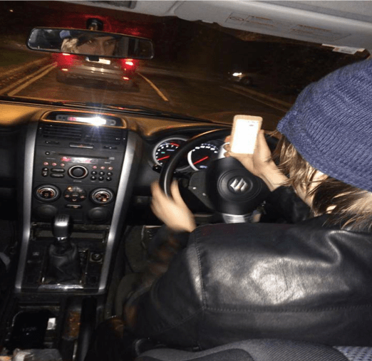
After each evaluation we conducted a debriefing session where we reflected upon any problems they had and features they liked. This allowed us to get more concise recommendations that we could pursue for our redesigns. It was an opportunity for the users to raise any particular issues and give feedback about the test in general in the form of a discussion. From our own analysis of the process, we could immediately see that huge considerations need to be made for a drive mode feature. Users were able to complete the task list with far more ease before driving the car in comparison to trying to work through the list while in transit. This is due to the fact it is difficult to focus visually on the road and the application at the same time. Users suggested the combination of a hands free kit would make it easier but even then it may be dangerous. Considerations need to be made in order to encourage application configuration before starting the vehicle. This way our Drive Mode is already set up and does not require any further visual attention. Some of the key revisions that we noted were:
- The mobile application takes a lot of concentration, which is dangerous while driving.
- Further increases the risk of accidents if user doesn’t employ a hands free kit.
- Users agreed that incorporating an audio element would be much more safer but only if the drive mode is initiated before undergoing a trip.
- Should be similar to a GPS with car tracking if visual elements are used.
-
One-touch overlays would make the process easier.
