Requirements
Following our assessment of our low fidelity prototype we gathered feedback, discussed and prioritized the lessons learned from the user evaluation. As stated previously, there were numerous elements that needed to reviewed and amended through thorough iterations. Our initial paper prototype was a form of horizontal prototyping. This gave the user a broad demonstration of the product’s features. It was an effective way to assess the interface design, accessibility and feature placement without having much of the features actually working. From this, we delegated the responsibility of re-designing one of three key features, with regards to the user feedback. This section of the report will discuss and display a re-design of the symbols, colours, text and the consistency between all three. Our previous prototype created some confusion regarding the relationship between on screen functions that depended on symbolism and colour. It was my responsibility to focus on this issue to diminish the users gulf of evaluation. The user should be able to easily determine where car parks are, that the icons are interactive and understand the meaning of symbols, colours and text. Careful choice of wording is important too as there was confusion regarding the word “free”. It was difficult to tell if it meant ‘free of charge’ or ‘free vacancy’.
Preparation
In order to make effective progression with our prototype, I adapted a vertical prototyping method. This would demonstrate an exact functionality of our product; specifically map interaction and design representations. To get a better feel of our original paper prototype, I created a quick digital version using Pop software. This was for my own benefit in order to obtain a better understanding of how the application would flow. I took photographs of each screen paper mock up and added hotspots digitally. I was then able to create a quick mock up for my smart phone. My plan from here was to evolve the paper prototype to a higher fidelity version with the adjustments made. I initially sketched out how I envisioned my second iteration. I then employed software JustInMind in order to create a digital version whereby I could organize user testing using a smart phone. Based on discussing the product during the user testing, we learned that we should not focus primarily on an iPhone version. Due to this, I opted to create an Android version for the purpose of this prototype.
Re-Designs
Main Map
I initially focused on the Main Map. This screen shows an overall display of the campus but has the option to see more specific data. Our original prototype had each car park featuring various colours depending on the type of spaces that it contained i.e. general, staff, pay etc. This proved problematic for learnability and required a lot of call back. I approached this problem by making each car park icon the same colour, which is yellow in this instance. The letters attached to the icons can differentiate them from one another.
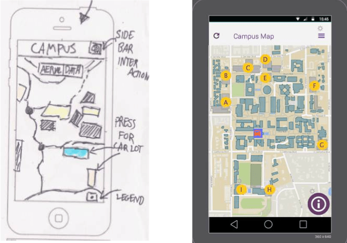
Side Menu
I implemented various forms of interactivity on this screen. The user can now press one of the yellow icons to reveal more information about the specific car park area, press the icon in the top right to reveal a side menu and press the information logo and the bottom right to reveal a legend. During our user testing, some people stated that they would prefer an alternative menu to display before this screen. This could potentially give them a better sense of control and location within the app. For the purpose of this prototype, I left the side bar option incorporated that would mimic the navigation paths of a main menu. The alternative menu can still be located before this screen but a side bar menu would give the user an alternative view of their options. When the user presses the Menu icon it reveals more of the apps functionalities (see below).

Legend
In order to give the user a better understanding of the icons on screen and what each one represents, access to a legend is implemented. This icon differs from the other yellow icons, which signifies that it performs a different purpose. The “i” represents information whereby a user may be incline to think that by pressing it they will be displayed some help. Once the legend appears it attaches meaning to all the icons with letters and other symbols used within the app (see below). Users can press “OK” when finished looking at it. Also note that the side menu icon is no longer accessible while the legend is displayed. This avoids the user over cluttering the screen and restricts them to only perform one visual task at a time. The legend gives consistency throughout the app and enhances the learnability of it.

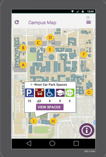
Marker Window
Once the user has understood what each yellow ellipse and symbols represent they can choose a car park. This digital prototype only has Car Park I with implemented functionality. Once it is pressed, the user is displayed specific information about the car park area (see below). It lets them know how many vacant spaces there are and of what type. They can then either choose to see more details by pushing the ‘View Spaces’ button or they can discard the call out by pressing anywhere outside of it. This feature was not integrated into our paper prototype.
Specific Car Lots
If the user selects “View Spaces” then they are brought to a new screen (see below). On this screen they are presented with a map that sports even greater details i.e. space locations, specific vacancies, space types etc. Here they have a choice to either view this information in the form of a visual map, which highlights specific areas and vacancies or they can switch to “Data View” whereby it provides the information in text form. It is down to the users preference which display they would prefer to engage in.

Highlighting Space Types
If the user decides to use the “Aerial” mode, they then have the advantage of highlighting the specific type of space they are seeking. Based on their knowledge from the legend (or even their real life understanding of the world) they can select the appropriate button at the bottom of the screen. Once pressed, it will highlight the area designated for that type and the user can see instantly what spaces are vacant (see below). Considerations will have to be made as to which colour to use for occupied spaces.

Data View
The idea behind having two forms of representations of the data is primarily to encompass the users wants. Some of our user testers claimed that they preferred to see the information in text form rather than a over stimulating visual. The “Data” view is also beneficial for those who are colour blind (see below).

 Stuart Creates