
This project assesses the iterative design and development process carried out in the creation of an Android mobile application titled ‘Right Here Right Now’. The primary goal of this project was to create an application that could provide users with an understanding of the current atmosphere at nearby Places of Interest (POIs). There is presently an abundance of mobile applications that offer smart phone users detailed information based on recent attendees’ reviews and ratings. However, there seems to be a noticeable gap with regards to the focus on temporal information. The ambience of a location frequently changes meaning attendee contributions made to existing applications can become quickly outdated and fail to answer questions about real-time attributes (i.e. Is a place busy? Who is there? Is something special occurring? Would I be interested in being there right now?)
![]()
This project highlights how the readily available information that exists on social media can be used to address the problem. It has become very common for those who attend POIs to post content that conveys their current activity on social media. In doing so, their content can give a snippet of real-time information related to a POI. The project was driven and refined by user centered evaluation, which provided an understanding of target users’ social media behaviours and requirements. By placing the user as the focus of the design process, ‘Right Here, Right Now’ aims to provide a consolidated view as to what is happening somewhere right now, allowing the user the opportunity to assess POIs’ attributes that regularly change.
Methodology
The design process included researching academic papers in data mining and HCI, previous projects that are relevant, user scenarios, use cases, building tasks and user testing techniques. Before the design and development process started, qualitative/quantitative research took place in order to shape and refine the product goal. An understanding of how users interact with their social media was obtained in order to make informed decisions about API choices. This gave early indication whether users post enough about their location so that the information can be collected and accurately convey an ambience. Furthermore, feedback was obtained regarding what real-time information users regard most important when seeking temporal data about a POI. This information was gathered using an online survey as well as conducting some semi-structured one to one interviews. Once an idea of the user’s typical “on the go” social media behaviour was formed about what attributes users think define a POI in real-time, work commenced on the first prototype.
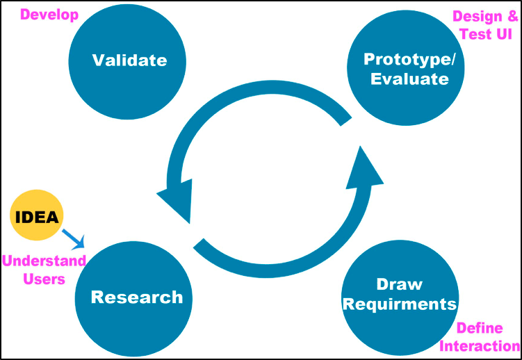
Iterative Design
Designing the interface was an iterative process which began with a pen-and-paper low-fidelity version. Paper wireframes were designed in order to go through a mock up in user testing. Prototypes became more advanced with time while simultaneously implementing user feedback into the design. The pen-and-paper prototype evolved into a digital click through prototype. This stage of the prototype presented the full potential of the application, demonstrating the complete interactive user experience.
When designing the mobile application, it was crucial to put the user at the heart of the design. In order to achieve user satisfaction, user feedback was incorporated into the development of the application. The progress of the application was repeatedly tested. The more user feedback that was gathered resulted in a better user experience. User testing commenced at the very early stages, before shifting focus to programming. 2D paper prototypes were very effective when attempting to iterate through design ideas at a higher speed. Three user tests took place: testing the low-fidelity paper prototype, which explored all possible design patterns, and testing the higher fidelity prototypes, which employed software tools. User tests were one-to-one sessions whereby the user was given a set of tasks to complete. The users were encouraged to think aloud when completing these tasks. This helped understand the thinking process behind user decisions. Each prototype attempted to mimic the real experience i.e. using cardboard mock ups of a phone whereby the paper screens can be manually swapped once interacted with. As timeframe was a factor, evaluations employed a minimum of 5 users. Nielson (2000) states that effective user testing only requires 5 users and that 85% of usability errors can be identified from this. At the end of each test session, the users had the opportunity to provide additional notes about the experience. Collecting this feedback at early stages was intricate as it diminished the amount of time exploring design patterns using development tools.
As with an iterative design approach, the product progressed to an even higher-fidelity version. The programming component of the application was done using Java. In order to realize the designs created earlier in the process and implement functionality to the design, Android Studio was used. Once development was complete, the application was subject to more user testing in order to fix any bugs and refine any existing UX issues.
