
At the very beginning, initial research and initial design exploration overlap. This is occurs as one is exploring how viable certain interactive media problem solutions can be in order to improve an issue in everyday living. A User Centered Design (UCD) framework was undertaken for the development of this project. Abiding UCD processes involved giving the needs, wants and limitations of the end user of the product extensive attention at each stage of the design process. However, before proposing any design solutions the scope, concept and planning had to be considered. This required revising the context, personas and vision related to the product in order to better establish realistic goals. Techniques such as brainstorming and mind mapping were used to aid in the exploration of the concept and the refinement of ideas.
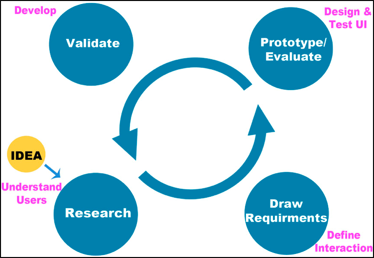
Iterative Design
Brainstorming, Mind Mapping & Sketching
The initial step in the design process was to stimulate the creative flow. This took place before any end-user research. The objective at this stage was to articulate all possible ideas and solutions for the problem statement. The first technique used was brainstorming. This technique encouraged any ideas relevant to the topic to be noted on a large refill pad. At this phase there were no limitations for creative ideas. It was preferred to have a broad option of ideas and then minimize the scope at a later point based on user feedback.
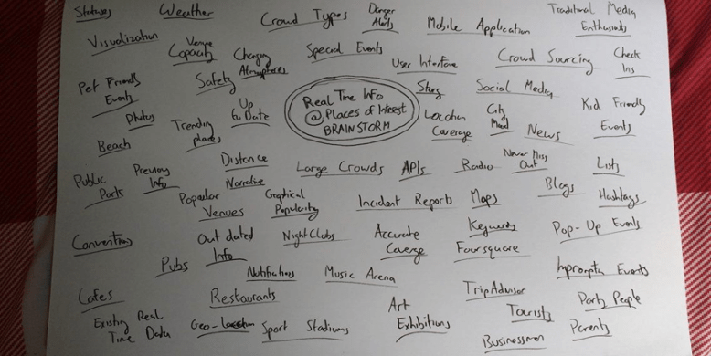
Brainstorm
Once a large number of keywords related to temporal information at POIs were collected, the keywords were organized visually using a technique called mind mapping. Using a large refill pad, major ideas were connected directly to the central concept, and other ideas branched out from those. Though mind maps ordinarily involve colour and imagery, this particular mind map was a rough outline.

Mind Map
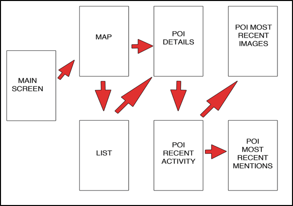
In addition to these exploration techniques, rough sketches (see Figure 14) were created at this early stage. Essentially these were estimated user interface sketches based on existing applications with similar functions. Although user feedback would ultimately determine the user interface, early sketches gave an outline of how the screen flow could potentially operate. Sketches gave way to visually conceptualize the main features and approximate structure of the application.

Early Rough Sketches
User Stories
After this point, field studies were undertaken to refine to learn more about the target audience. From this research, it was possible to draw requirements and to begin imagining what features could the application possess. Once the key features of the application were ranked by importance, these needed to be imagined functioning together through the method of user stories. A user story presents a feature in terms of a task that the user wishes to be achieved. Essentially a user story describes something that the user wants to accomplish by using this mobile application. Research showed that this application can be of benefit for multiple user types that all fall under the umbrella title of“POI attendees”. Although users can be quite similar in terms of their goals in using the application, it is helpful to choose one as the primary user. This is the user for whom the app is primarily designed. Focusing on one user type can avoid too much generalization in the design process. User research indicated that this application would be of best use for the 25-35-year-old nightlife event attendee. The formula used to create the user stories was as follows: “As a [user], I want to [function], so that [value]”. These stories must be short and specific. If a user story is too broad it is deemed as an “epic”, which means it is broad in scope and too large to be described in detail while avoiding complexity. The goal is to identify separate functional components to implement within the same feature.
Prototyping
An iterative design approach was adopted in order to refine the product while moving forward. Jakob Nielson explains how ordinarily one would complete a design and identify the problems that arise when using it. The problems that are highlighted would then be refined during the next iteration in order to remove them. User feedback is typically used in order to assess the issues and develop the product. In theory, each prototype becomes better than the last. Prototyping techniques can radically improve work, increasing usability with each iteration. It can be split into three types: low-fidelity, medium-fidelity and high-fidelity.
Low-fidelity: this method is the easiest to undertake. It is cheap and very time efficient. Ideas and concepts can be roughly sketched up on post its, paper, white boards etc.
Medium-fidelity: this method is a bit more advanced that low-fidelity. It concerns more specifics such as colours, fonts, positioning specifics. Due to it being more complex, it is more time consuming and also can be more expensive. These prototypes shall be done using Adobe Photoshop and then implemented into a click through prototype on InVision.
High-fidelity: this stage of design is very close to the final product. It is the most time consuming and the most expensive. All major flaws should be addressed before reaching this stage. This stage is a working prototype on an Android phone.
The earlier a product is tested with users, the earlier issues and problems can be identified. The quickest way to highlight any issues is rapid prototyping. Using paper, pen and sticky notes, a low-fidelity prototype of the mobile application was created. This prototype was a mockup of what the finished product might look like. The first prototype aimed to reveal any major flaws with the user interface. Based on the research to this point, a screen flow was created The UI of the interchangeable screens was influenced by what previous user feedback had provided. The sticky notes help denote any screen dynamics such as drop down menus or overlay boxes.
Rough Screen Flow
Paper Prototype
15 screens were built for the paper prototype.Below are some pictures. This prototype was then used for user testing.
Re-Design – Digital Prototype
The lo-fidelity user testing indicated foundational flaws in the initial design. This testing proved to be very time efficient in the sense that erroneous design choices were highlighted in the early stages rather than realizing them mid-development. The users’ suggestions could now be implemented into process thus strengthening the prototype. One issue that arises from pen and paper prototyping is the lack of colour or effective font use. Progressing the prototype to a higher fidelity in the form of a digital artifact is a remedy for this issue. A re-design of the original sketches were created using editing software Photoshop. This mobile application was to abide Google Material Design techniques. Adopting these techniques with regards to colour and fonts make applications more aesthetically pleasing, The Google Material Design guidelines state that colours must be “unexpected and vibrant”. Their material design is influenced by “bold hues juxtaposed with muted environments, deep shadows, and bright highlights”. After some experimentation with various colour palettes, I chose my primary, secondary, accent and text colours.
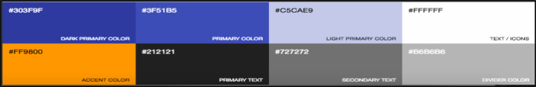
App Colour Palette
Using Photoshop to create the screens for the higher fidelity prototype allowed the opportunity to later test features that were difficult to assess with the low-fidelity version. It was now possible to make the application a better aesthetic experience for the user and, more importantly, make certain features stand out more. In order to use the screens that were created using Photoshop in the next user testing, interactivity had to be implemented into the JPEGs. The goal of the medium-fidelity prototype was to replicate the end product as close as possible without having to depend on programming and functionality. Connecting the wireframes together with some navigation is called click-through prototyping. Its purpose was to demonstrate the flow of the application.
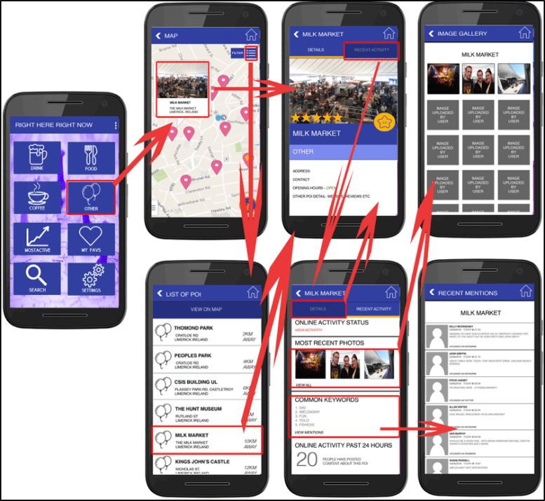
Wireframe Flow
To add interactivity to the app’s wireframe, prototyping tool InVision was employed. This tool offered the capability to navigate from one screen to another. This was accomplished by adding “hotspots” to selected areas of each screen. Once a hotspot was assigned to a specific area of a screen i.e. a button, it was then allocated instructions as to which screen it must navigate to once it was tapped. Once all interactivity was added to the wireframe, it was then ready to be exported and tested on a mobile application.
Click here to view the click through prototype on your browser.In among all the prototyping was the crucial user testing. Click here to check out how the user testing was carried out.
 Stuart Creates